Tags
art, digital media, digital painting, drawing, illustration, illustrator, illustrators journal, innovation, jazz, levinland, lon levin, painter, painting, saxophone, social media, Sonny Rollins, technology, this week in digital media on blogtalk radio, xanate media
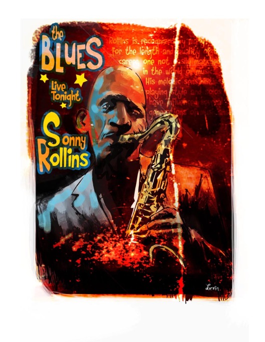
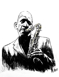 After I did the Pinteop Perkins piece I thought I try a variation of that approach to another musician. I found some scrap of a young Sonny Rollins I liked and made a quick sketch of him. I brought the sketch into photoshop and search for a way to unify the lines into a more black and white approach as my base layer. I decided on the cutout filter and played around with the settings until I got something I liked. It had an abstract yet designed feel to it. Next I start to paint solid color into a layer that was set to darken so it wouldn’t bother the black line draw below it. (layerwise)
 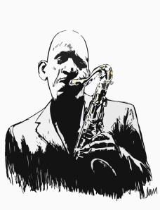 This part was fun as I could be free with my brush strikes and the brushes I used. It took a while to get the basic feel and keep it loose looking but it was well worth it. I added a lens flare like a backlit stage light strategically behind his head. This seemed to be the right place for it and would draw focus to the face of Rollins which was essential to making the piuece work.
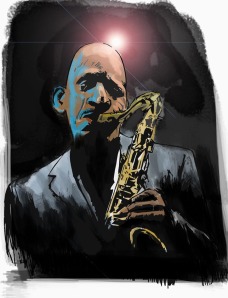 Next I added layers of color and texture which I wanted to reflect Rollin’s music. I tried many different color combination until I ended up with a fiery orange-red look with splats of yellow. red and orange.The art started to dictate to me where it should go and that’s the sign I always wait for. I know at that moment it works, I just have to bring it home. As I looked at what I had I realized a happy accident had happened near the bell of the saxophone. It looked like an explosion coming from the horn. I decided to add type to give it a finished quasi-posterish look. I didn’t really know what to put on there so I borrowed from the Pinetop Perkins type and embellished. When I realized that wasn’t enough I added some words about Rollins from a review that I layered in and knocked back over a field of color.
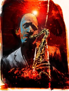 I must’ve adjusted color and size of type a dozen or so times.I could’ve used illustrator and had a slick type treatment for the copy but I wanted a raw feel and I liked the font I had used previously with the “Pinetop” art so I stayed with it. Back and forth I went with color saturation masking color out here adding some there until I felt like it was working. The last little bit I needed to do was pop out the “cool” side of Sonny. So I added some blobby strokes of blue to his face and jacket and the balance of cool to warm was finally there. I played around with the type a little more. I had to separate the “S” and the “R” so I could fit the letters together better. Again illustrator would’ve made it easier but this was a “portfolio sketch” so I kept it more spontaneous.Finally I added white space around the art and gave the vignette a shape. I was done and happy enough with it to share the process of how I arrived at it. I’m not sure if I’ll put it in the portfolio butI did learn more about how to achieve a look like this.

Reblogged this on The Illustrators Journal.