Tags
artist as brand, digital media, illustration, illustrators journal, innovation, Levinland studio, lon levin

Posted by Illustrators Journal | Filed under EDITORIAL, ILLUSTRATORS JOURNAL E-ZINE

08 Monday Jun 2020
Tags
artist as brand, digital media, illustration, illustrators journal, innovation, Levinland studio, lon levin
Posted by Illustrators Journal | Filed under EDITORIAL, ILLUSTRATORS JOURNAL E-ZINE
07 Friday Apr 2017
Tags
artist as brand, Caroline L. Arnold, Darren Hardy, digital painting, drawing, illustrators journal, Levinland studio, lon levin

This is what I worked on this week. It’s an illustration from my upcoming book about imagination.It’s not done but it’s close enough to show. It started as a sketch of three kids modeled after my daughter’s kids and blossomed into what it is now.
I ask the question of you like I ask the question of myself. What have I done this week, this day, etc Most of the time we are on auto-pilot and don’t think too much about what we’re doing. We have house chores, bills to pay, assignments to complete, kids to take care of etc. The thought of having another goal or task is overwhelming, especially a personal goal. So those goals like I’m gonna write a children’s book or create a painting seems like it can wait.However taking it in small does you can accomplish a lot. That’s how I approached this art and all the other projects I set for myself.
If this resonates with you you may want to read “The Compound Effect” by Darren Hardy or Small Move Big Change by Caroline Arnold.
Keep up the good work, watch for the Spring Edition of the Journal and much more to come!
01 Sunday May 2016
Posted in graphic novel
Tags
artist as brand, graphic memoirs, graphic novel, illustrators journal, innovation, levinland, lon levin, webcomic

There are parts of Mary Rockcastle’s experience I relate to even though I’m a man. I too remember hiding my artistic bent from my friends and others because of the stigma my father laid on me about being artistic. He assured me something was wrong with me and the only men he ever knew that were artists were set directors (code for gay). Looking back on it I can’t help but wonder if my father ever went to a museum or was aware of Chagall, Picasso, Da Vinci, etc
It is true I did not feel I had to hide my Superman comics or my Mad magazines, although my Archie and Richie Rich comics were hidden away. So now when I see an article like the one below I am dumbfounded that this is an issue. I shouldn’t be given the current state of affairs in our world and our country (Trump and his women-hating followers) but I am. So in a small way I’d like to be part of the solution instead of the problem.
I love creating artwork for my webcomic/graphic novel panels “The Kid From Beverly Hills” I have respect for anyone, male or female who travels down the same road. Their experiences and point-of-view is essential to our collective understanding of culture in the 21st century.

26 Tuesday Apr 2016
Posted in graphic novel
Tags
artist as brand, cartoonist, digital media, graphic novel, illustration, illustrators journal, levinland, lon levin, webisodes
 As I explore my own version of a graphic novel comic or webisode I am more interested in what is transpiring in this genre. As I explore I will post more and more so that those of you who follow will become more aware of the explosion of new form novels and artwork around us all.
I shook off the shackle of my illustration style a few years ago. I had been doing children’s book illustrations and animations and after three dozen books, most of which I did not enjoy doing I started to fool around with this idea of depicting my story, my history in words and pictures. I’m not really a writer per se even though I have been published as a writer (“Treehouses” published by Globe Pequot Press in 2008) I wanted to accompany my art with words. The logical conclusion was some sort of comic, graphic novel, art mismash. After a few decades of time in the commercial art world as an art director, creative director, animator and illustrator I felt I’d earned the right to do whatever the hell I wanted to do. No rules except the ones I made for myself.
To support this notion I decided I needed to split my time between a “real” profession as my father would say and my artistic exploration. Now after a few years I work as a realtor to support my art. Hence, I am liberated from the grind of wondering how can I sell myself as an artist.
What has evolved is “The Kid From beverly Hills” which I’ve posted here and there and it has gotten favorables reviews by the few who have seen it. AS I evolve, it evolves. The journey is what makes it fun and exciting not the result. More from me later…
Here is a graphic novel list compiled by Sam Thielman of The Guardia
Ware, like Dan Clowes, Charles Burns and Lynda Barry, is drawing on a very different tradition from superhero artists and writers. It’s a kind of storytelling that evolved out of the “underground” comics movement of the 1960s and 70s, when artists like Robert Crumb, Aline Kominsky, S Clay Wilson and others were trying to find ways to make dirty, weird, intensely personal work that had more in common with the iconoclastic fine art of the period than with pulp fiction – the prose genre that birthed the first superheroes. Independent comics used to be considered as disreputable as pornography (maybe more so), but now they’re rightly recognized as fertile ground for artists.
In fact, the two parts of the industry are increasingly coming together. Avatar, Image, Dark Horse, Dynamite and Boom all publish plenty of creator-owned, artist-driven books. In many cases, they’re by people who made names for themselves writing superhero comics and want to write with more freedom at a place where they own their work. The state of the industry makes for some strange bedfellows: Top Shelf publishes pensive ruminations on life and absurdity by Eddie Campbell and Jennifer Hayden, but they also publish Alan Moore’s action-packed pulp-fiction mash-up The League of Extraordinary Gentlemen.
For longtime comics fans like me, it’s a kick to see the form evolving in so many fascinating ways. Image in particular has landed right at the nexus of art comics and action comics and produces books driven by beautiful, often hilariously strange art (James Stokoe’s Orc Stain, Warren Ellis and Declan Shalvey’s Injection) and old-fashioned high-concept sci-fi action, sometimes on the same page. The innovation is opening up the form to a whole new generation of readers.
Here are the 16 books I recommend to get you started, if you’re so inclined. They’re all in print, they’re all readily available from Powell’s or even a local independent bookstore, and you don’t have to do any preliminary reading to understand them. Happy reading. And looking. And good luck finding space for them all.
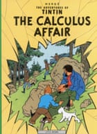
All 23 Tintin albums follow the globetrotting boy reporter and his companions, chiefly his dog Snowy and his tipsy, short-tempered sailor friend Captain Haddock. But there’s a long-running debate about which is best; the settings are vastly different, ranging from China to the Moon. My vote is for 1960’s The Calculus Affair, a thrilling and lighthearted story of cold war espionage and a secret weapon in the Balkans.
Hergé’s characters have exaggerated features, but they exist in a meticulously detailed world where there are no misplaced lines or scratchy pencil-work anywhere on the page. Joost Swarte, a cartoonist and illustrator who admires Hergé, coined the term “ligne-claire” (clear-line) to describe it. The phrase didn’t just stick, it came retroactively to describe the whole coterie of cartoonists who came after Hergé, called the Brussels school.
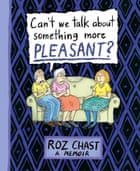
Roz Chast is probably best known to non-comics readers for her wry and wordy New Yorker covers, and her cartoons for same. You’ve probably seen them – they’re often lists of anxieties and phobias and distractions. In her half-prose, half-comics memoir, Can’t We Talk About Something More Pleasant? Chast pitilessly itemizes in excruciating and hilarious detail exactly the share of suffering allotted to her beloved parents as they rapidly enter the last years of their lives.
Chast’s sense of humor never deserts her even when her parents’ bodies fail them, and the resulting volume, which won a National Book award, is both an ingenious depiction of a part of life most people studiously avoid thinking about, and a slow-burn dissection of Chast’s own obsessions, and her love of distraction as a momentary respite from entropy.
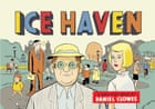
Daniel Clowes has been pretty open about his love for both Nabokov and for Charles Schulz’s Peanuts cartoons. In Ice Haven, he combines the two melancholy artists’ styles to beautiful effect.
Clowes’s formidable skill is anything but cold: the little book (only 88 pages) follows the interlocking lives of a few people in a small town and works out childhood fear, teenage ennui and grownup eccentricity. These themes play out across pages designed to look like comic strips from the local newspaper; it’s so subtle and sweet you might not even notice the kidnapping at first.
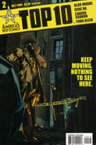
The premise of Top 10 is so fundamentally opposed to the way superhero comics work that most writers would have run from it screaming: what if everyone in town, from the hot dog guy to the mayor, was a superhero? Bursting with flashy costumes, terrific sight gags and all the strange settings you’d need to build a city for such a diverse populace, the book isn’t so much an introduction to superhero comics as it is a hilariously off-kilter sci-fi detective novel.
Top 10 is also some of the most purely fun comics storytelling available, thanks to a first-rate script by ingenious Northampton comics writer Alan Moore and art by Gene Ha and Zander Cannon. The three work together as seamlessly as a jazz trio: The story is a complex procedural involving multiple murders that follows our heroine, Robyn, as she joins the force and gets used to having a boss who’s a dog, a partner who’s a Viking and a workplace filled with drinking buddies who range from the figuratively hotheaded to the literally radioactive. Though he’s perhaps better-known for Watchmen and V for Vendetta, Moore’s unparalleled skill at making the reader look left when the plot is just about to go right might be at its very best here.
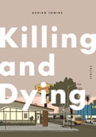
Adrian Tomine’s most recent collection follows six different sets of characters through six different styles of artwork so distinctive they appear to have been drawn by six different people. It’s a feat of virtuosity that could only have come from Tomine, who has been telling tender stories like these for over a decade; with its incredible stylistic diversity – always surprising, never jarring – it’s his finest hour so far.
In each story, Tomine seems to announce he’ll be telling one kind of story only to tell a completely different one in hints and suggestions. Like his friend Clowes, Tomine’s ambitions are primarily literary and comics are simply his chosen literary mode. Here, he makes a compelling case for comics as a medium for the same intricacies as contemporary fiction – and for the possibility that comics can do some things prose can’t.
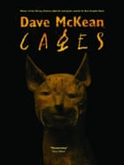
Dave McKean’s sprawling, generous graphic novel about life, sex and jazz is a necessary jolt of pure, intelligent optimism among a lot of very dark work from his contemporaries. The artist is probably best known for the beautiful collage covers that became his trademark at DC Comics’ “mature readers” imprint, Vertigo, but he’s a formidable writer on his own, here drawing the parallel stories of a half-dozen people living in the same apartment building and falling in and out of love with art, life and each other.
The book is bigger than most – tall and wide, as well as almost 500 pages long – but it’s a surprisingly fast and engaging read, with McKean’s beautiful, scratchy two-color linework giving way at strategic points to breathtaking pages-long sequences of full-color collage and painting in which McKean illustrates a weird and charming cosmology of his own devising.
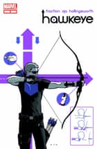
It hasn’t been easy to find Marvel Comics stories that let the new reader in the front door, but Matt Fraction and David Aja’s Hawkeye is arguably the best of the company’s recent crop of beginner-friendly comics. (Dan Slott and Mike Allred’s kid-friendly Silver Surfer is a close second.) Marvel’s books are carefully orchestrated across a universe that spans more than 50 years of material, but Hawkeye ignores most of that, to its great benefit.
The book follows the least reputable of the Avengers as he tries to keep sleazy Russian crimelords from stealing his apartment building out from under his working-class neighbors. The book’s vision of factions fighting for a piece of gentrifying Brooklyn is dead-on, and Fraction’s cast of offbeat characters could be culled from the co-op next door. Aja’s artwork is spare and clever and the pair hit a serious Lennon-McCartney groove near the end of the second arc, in a story told entirely from the perspective of a dog who listens in on scenes from previous issues with a deep understanding of human emotion but a very limited English vocabulary.
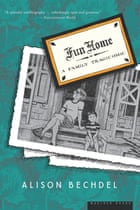
In Fun Home, Bechdel steadfastly refuses to sentimentalize the way her discovery of her own sexuality paralleled her discovery of her father’s secret life. The book is beautifully constructed, with her declared annoyance at her father’s fussy, baroque tastes informing her work’s own spare beauty. And for all her teenage self’s eye-rolling over her funeral home director dad’s love of artifice and adornment, Bechdel’s ability to draw her characters’ most revelatory tics and habits remains razor-keen, often painfully so, for the length of the book.
The love between a father and daughter is complex in the best possible version of the relationship, and Bechdel and her dad’s is particularly fraught, not least by the latter’s suicide. Because Fun Home is ultimately an exploration of devotion and longing, its frankness is that much rarer and more precious.
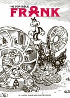
All of Jim Woodring’s glorious Frank stories are so terribly inviting that it is difficult to pick just one. Woodring draws the wordless adventures of a bear-cat-chipmunk-type creature named Frank, whose travels take him around a surreal black-and-white world populated by adorable creatures and nightmare horrors, and nearly all those travels manage to end on an unexpectedly poignant, funny or terrifying moment. Woodring’s style is fanatically controlled – every panel looks like a woodcut – but his monsters are unspeakably inventive, like something Hieronymus Bosch would have made in pottery class.
The plots are as simple as the art is complex: Frank usually makes what seems like a reasonable decision from the his own perspective and a horribly, horribly wrong one by the standards of the broader world. (Come to think of it, that is probably the shortest possible biography of anyone alive, from a certain angle.) Fantagraphics’ collection of short Frank stories is a great sampler, like a glass of water from the Challenger Deep.
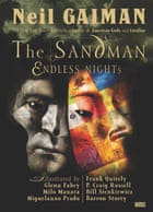
For the better part of 20 years it was very difficult to pick a volume of The Sandman to introduce readers to its charms. Neil Gaiman doesn’t hit his stride until the second book in the 12-volume series, and the art doesn’t really take off until then, either. But who wants to begin in the middle?
The writer solved this problem by penning seven stand-alone short stories for the one-off volume Endless Nights. The result was as attractive a volume of comics as a superhero publisher (DC, in this case) has ever managed to produce. In it, readers meet the seven Endless, Gaiman’s pantheon of anthropomorphized abstractions including friendly, frank Death; moody Dream; alluring hermaphrodite Desire and his/her twin sister, Despair. Every story is illustrated by a different artist and each one is worth getting to know, particularly the great Italian artist Milo Manara and P Craig Russell, probably best known for his stylish comics adaptations of operas by Wagner and Mozart.
The fun with The Sandman – like Gaiman’s best novel American Gods, a calculated hodgepodge, if there is such a thing, of stories short and long – is often the way the author allows insight into his otherworldly central characters through the pinhole of a seemingly normal, knowable person’s perspective. Here, he’s mastered that technique. The adroit short pieces are one of the reasons the series remains so popular despite its far-flung sci-fi and fantasy conceits: it’s less a three-course meal than a box of candy you didn’t mean to eat in its entirety.
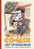
For people needing a primer on grownup comics, the ur-text didn’t really exist until two years ago, and that’s because the evolution of high-art comic books from greasy underground innovation to literary supplement is largely the work of a single guy: Art Spiegelman.
Spiegelman is justly famous for his comics memoir Maus, about his father Vladek’s escape from Auschwitz and the relationship between Art and Vladek in the years when the book was being composed. But Spiegelman was also the editor of Raw, an anthology series that drew together the best and brightest of the underground comics world at a time when the market was sagging under the weight of too many people trying to ride the same gravy train.
As other publishers collapsed or radically shrank, Raw became the Paris Review of comics, every page risky, bizarre and invariably beautiful, with Spiegelman’s own work as the book’s anchor. Co-Mix is partly an exhibition catalogue of a Spiegelman career retrospective bearing the same name; it’s also a collection of excerpts from Raw and other ephemera, and a wholly necessary study of the form’s escape from the gutter and (in this case literally) into the museum.
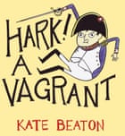
Kate Beaton’s hyperliterate webcomic is on the cutting edge of any number of social realities. Her Sexy Batman strips are as clever a parody of tightly clad contemporary superheroics as anyone has written. But she’s also fascinated by the arcane, the old-fashioned and the obscure, particularly as they pertain to women through the ages. Never preachy or shrill, the strip’s meticulous consideration of history’s funniest footnotes run counter to her excellently messy artwork.
It’s often said, and correctly, how smart the comic’s writing is, but artistically Beaton has few equals and fewer competitors; she’s working in a style almost no one practices anymore, where what looks like a quick pencil rough is specific enough to convey a whole range of complex emotions. Beaton lists Ronald Searleamong her favorite artists, and it’s easy to see the great illustrator’s influence.
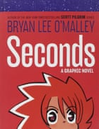
Bryan Lee O’Malley is probably best-known for his series of manga-style action comics about a slacker living in a version of Toronto that plays by the same rules as a video game, Scott Pilgrim. In Seconds, he’s in the same place – well, Canada – but his twist is more fantastical than science-fictional.
Without giving too much away, O’Malley is an accomplished chronicler of post-adolescent longing. What if we’d taken this job instead of that job? What if we’d never broken up with that guy or that girl? His heroine, immature, compelling and unhappy, gets to find out – it’s like if It’s a Wonderful Life was a fantasy manga about restaurant workers. O’Malley is that rare artist who works in confessional and speculative modes simultaneously; his world may have fantastical quirks in it, but it also has quotidian heartbreak.
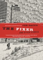
Nobody is doing what Joe Sacco is doing; the writer-artist has visited some of the world’s worst war zones and not merely written movingly about them but carefully drawn them, as well. The effect is transporting – Sacco drags readers into war-torn Bosnia and gives them both a sense of place and a sense of urgency, and like the best journalists, he’s got an eye for the rich, contradictory, infuriating people who can make you care about something you ought to care about.
In the title story of this astonishing collection of short nonfiction, Sacco focuses on a bored ex-mercenary with nothing to do after the end of the long and horrifically bloody war. On the one hand, it’s about wartime abstractions like reparations and displacement; on the other, it’s the incredibly urgent tale of an edgy, frightening guy who’d rather be killing people and may yet get to.
Chris Ware is intimidating. The artist’s biggest works are pointedly impossible to read from the beginning – just trying to get past the dust jacket on Jimmy Corrigan: The Smartest Kid on Earth can take days. But the final “issue” so far of Ware’s long-running Acme Novelty Library is a little hardbound graphic novel that follows one man from birth to death and many strange points in between. In just the first few pages, Ware invents new narrative tools to describe learning to recognize your own name, discovering colors, and what it feels like when you see your father hit your mother.
Eventually, the book may simply end up a footnote in Ware’s ongoing graphic novel, Rusty Brown. But at the moment, it’s the purest distillation of his ingenious use of hard lines, flat colors and an engineer’s genius for describing complexity without reducing it.
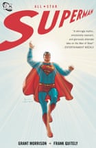
You can leave most superheroes off a list of great comics at this point, but not Superman. The Man of Steel’s mark on American culture has been indelible, and it has also resisted updating – the last four Superman films have been disastrously lame.
But in All-Star, writer Grant Morrison and artist Frank Quitely strike exactly the tone that film-makers have missed: modern and clever without being snide or ironic, optimistic without naiveté, and, thanks especially to Quitely, utterly beautiful. The artist’s rendering of the Man of Steel is sneakily reverential – if the cover of the book looks like you’ve seen it somewhere before, that’s because it’s a fairly overt homage to images of Jesus at the last judgment. It’s also playful and fun, with a gorgeous sequence on the inverted-logic Bizarro World (the planet is square, of course) and the kind of lighthearted interplay with Lois Lane and Jimmy Olsen that aren’t usually found outside much older books.
14 Monday Mar 2016
Posted in CHILDREN'S BOOK, EDITORIAL
 Once upon a time I dreamt of marrying my stories and images to the internet and combining words, music, voices and pictures. Of course that’s all being happening for a while. One of the early adapters was and is Roxie Munro, who I’ve interviewed and talked to numerous times. The article below includes her and beyond. It’s a good article that covers this new form which is coming of age.
 Once upon a time, some crazy smart person got the idea of taking a children’s story previously passed down through oral storytelling and turning it into a book. This spawned a whole new tradition, and an industry that has thrived for centuries with a work-flow process that involves several distinct phases and teams that take several years to achieve the goal of creating an illustrated story book.
It works like this:
An author first creates a manuscript that is acceptable to an editor. The editor will then work with the author to bring that story to a point of excellence, at which point this editorial team passes the story off to a design team.
The art designer will select the perfect illustrator, who must then be given ample time to realize his or her vision. The designer then lays out the book, selecting fonts and other design elements, and drops in the finished artwork.
The combined effort is provided to the production team in the form of print-ready galleys eventually to be published. And while proofs are being run to test for color and trim accuracy, the marketing team revs up the process of distributing the book to reviewers just as the sales team works to get it into stores.
It is a proven practice and will remain the preferred method of making an illustrated story book for many years to come. Because it works. For books.
But the job of realizing the electronic cousin of an illustrated children’s book—the story app—requires a very different process and a new cast of characters. It works something like this…
 In the digital ecosystem, production speeds up with teams working more in lock step, rather than relay style. New editions are possible with the click of a few buttons, making it possible—even favorable for testing purposes—to publish a work in iterative chunks; that is, not in a fully finished state, but a simplified one that is added to over time.
The author, editor, and publisher tend to collaborate more at the outset to realize a manuscript not limited to a story text, but requiring content for interactive elements, text boxes, navigational instructions, etc., as well. And the creative team expands, adding to the ranks of editorial, design, and production teams, the following contributors:
To wit: It takes a lot of people-power to realize a great story app.
 Team efforts overlap. For example, in our current process, as author Mary Hoffman and team editor Emma D. Dryden have been working together to perfect the manuscript for In the Footsteps of Giants, I’ve been working with our art, user interface, and user experience consultants to design the look and feel of our future story app.
Mary and I have been preparing a list of image suggestions to pass off to our photo editor, Cynthia Carris Alonso, who has begun the process of researching and obtaining rights to use the visual content to accompany Roxie Munro’s original artwork commissioned at the start of the process.
In the meantime, our marketing team, including Dan Blank and his team at WeGrowMedia is already strategizing plans in anticipation of a June launch. And I am now on the hunt for vocal talent that can record and send to us raw files that we will then engineer with added sound effects. (If you’re interested in auditioning, contact me here.)
We couldn’t do any of this without at least a draft story to work with. But neither did we need a completed manuscript to begin production. Indeed, the first and last piece of the puzzle to be signed off on will be the manuscript, for it will likely change again once we are inside the recording studio.
Which is why I say that creating a story app is a team sport, and a highly collaborative effort at that!
09 Sunday Aug 2015

Remember Beverly Park and the Kiddie Rides?
From 1945-1974, children growing up in Los Angeles had their own mini-fair year round. Beverly Park operated on less than an acre, on the corner of Beverly Blvd. and La Cienega, the present home of the Beverly Center Mall. There were usually about twelve kid-sized rides, as well as animals, hot dogs and cotton candy. Parents sat on benches watching their children ride the merry-go-round, and birthday parties were celebrated at picnic tables. For the children who grew up going to this pebble-strewn, family- run park, it was a respite from city life- quite simply put: “It was heaven.”
Article By Hadley Meares | November 1, 2013
Art by Lon Levin 2015
26 Sunday Jul 2015
Tags
artist as brand, Beverly Hills, cartoonist, graphic novel, illustration, innovation, levinland, lon levin, Nate n' Al

Posted by Illustrators Journal | Filed under illustration
16 Saturday May 2015
Posted in EDITORIAL, illustration
Tags
andrew lustig, artist as brand, artwork, drawing, graphic novel, Jewish artists, levinland, lon levin, marvin schotland
Over the last year and a half I’ve been working on different kind of projects using a more serious graphic novel style. I’ve been fortunate for some publications to give me a chance to show what I can do. This newsletter shows some of that work. There is more to come and as they are published I will show them on this site. This is a perfect example of transforming yourself into something different if you want. I encourage anyone who is contemplating a move like mine to go for it. You never know where it leads and it will challenge you and you will grow creatively.

01 Friday May 2015
Posted in EDITORIAL
Tags
Bill Walton, Blake Griffin, Chris Paul, Clippers, Irving Levin, lon levin, Spurs, Staple Center, Steve Ballmer
![]() This is the official NBA explanation of the Clippers name origin:
This is the official NBA explanation of the Clippers name origin:
In 1978, San Diego welcomed the relocation of the Buffalo Braves’ franchise because the city had lost their Rockets to Houston seven years earlier. San Diego team officials didn’t think ‘Braves’ was a representative nickname for the club. A contest decided on Clippers because the city was known for the great sailing ships that passed through San Diego Bay. When the Clippers moved to Los Angeles in 1984, they kept their nickname.
And now for ‘the rest of the story‘. In 1978 I joined the Clippers as Advertising Director. I was hired by my father Irving Levin, the owner of the franchise. The team history and glide-path from Buffalo to San Diego is perhaps coherent given the market conditions at  the time (see: The Boston-San Diego Shuffle and The San Diego Clippers: A Dream Ends), as my father was growing increasingly weary from non-stop commuting between Boston and LA when he owned the Celtics. My father was being pummeled in the Boston Press for bad trades that resulted in the Celtics going from a championship team to a losing franchise – not a good thing in Boston. He wanted a way out. Through a series of talks and meetings involving league officials, he and John Y Brown (owner of the Buffalo Braves) agreed to a deal to switch franchises and players. Prior to the ’78 season in San Diego my father decided to change the name of the franchise which was moved from Buffalo as a way to get the city involved with the new team along with the fact that the previous name had nothing to do with the San Diego area.
 The advertising agency of record for the Clippers along with team officials in which I which actively participated oversaw the contest. Most of the Clipper officials involved in this process were in their 20’s like me save for Irv Kaze, Hal Childs, my Dad and Lou Lenart. Tons of suggestions came in and we considered everyone of them. Most were ridiculous or totally inappropriate though we had a great deal of fun and laughter vetting through the submissions. How we arrived at the Clippers is as mentioned above in the official NBA line. However before the name was formally chosen my dad and I went to the San Diego harbor where the Star of India ship was docked.
  It was and remains a beautiful boat and legitimate icon of San Diego. We looked at the ship and in the moment my dad said he thought naming the team the Clippers was a good idea since people could identify with the local icon. We talked about possible cross promotions etc. Not totally on board with naming, I thought we should call the team the Stars but Dad thought it sounded like a team the Globe Trotters (an exhibition vs. real competitive team) would play. And back at the office the general feeling was the name was not that good but we had nothing better. The ad agency came up with some logo looks to visualize what the “Clippers” brand would look like. As a trained designer and advertising director I thought the logo was awful, I hated the colors and the uniforms were of the ‘pajama’ blue variety. I’m not sure if anyone shared my opinion but Dad liked all of it so it became the official logo and the name Clippers was born (so there you have it – a moment of inspiration codifies a name for a league franchise now valued at $2 billion).
Looking back the name ‘Clippers’ has become a ‘Kleenex’ or ‘Xerox’ play of sorts. It is the team brand yet no one associates it with ships, the ocean, the city of San Diego or LA Marina for that matter. This is just like the ‘Lakers’ (birthed in Minnesota – the ‘lan of 1000 lakes’) as their name has nothing to do with Los Angeles either.
I was asked by a magazine writer recently what I thought about the rebranding of the Clippers. The technology shows at the arena, the colors, the throwback uniforms etc. I told him what my dad always told me and he was right. If you win everything works, if you lose it nothing else matters – it’s all chatter.
For the Clippers to emerge from their dark past of losing (the Sterling Years) and the grey cloud that hangs over the franchise they need to win…and Saturday’s game against the Spurs is the biggest game in franchise history since opening day in 1978. When you consider that San Diego may be poised to witness another professional and some may say ‘trophy sports property’ loss, i,e., with the rumored potential exit of Chargers to LA, one can only speculate that perhaps a Clipper win against it’s nemesis San Antonio Spurs is an honoring of the long suffering San Diego sports community spirt and karma. We shall see….
06 Friday Mar 2015
Tags
art, artist as brand, cartoonist, illustration, innovation, lon levin, this week in digital media on blogtalk radio

I love the color and clean architectural lines in Riikka’s work. A bit of whimsy and a storyline are infused in the imagery. For more about Riika go to here
This article and profile is running on Eye on Design. Info below.
Hey look, everyone’s favorite professional association for design has its own blog.
For the past 100 years, AIGA has celebrated, lauded, applauded, championed, cheered, awarded, supported, and (most of all) loved great design. In the next century we expect to see a lot more, so we’re turning a well-trained eye on the best new work from emerging and established designers alike in the AIGA Eye on Design blog.


